22 - 09 - 25
TASK ONE:
- Choose a party game description.
- Use collage cutouts to block out a design for the front of a game box.
CHOSEN PARTY GAME: Cowboy Countdown
"Play the quickest hand in the west!"
CHOSEN PARTY GAME: Cowboy Countdown
"Play the quickest hand in the west!"
a high-speed reaction-based card game themed around a cowboy duel. 12 rounds to get rid of cards before the clock strikes high noon.
Using the description above, I created the collage seen on the left. The idea I had in my mind were two of the game cards are having a showdown duel.
Refining in Adobe Illustrator and using the Collage (left) as a base to create box design (right).
29 - 09 - 25
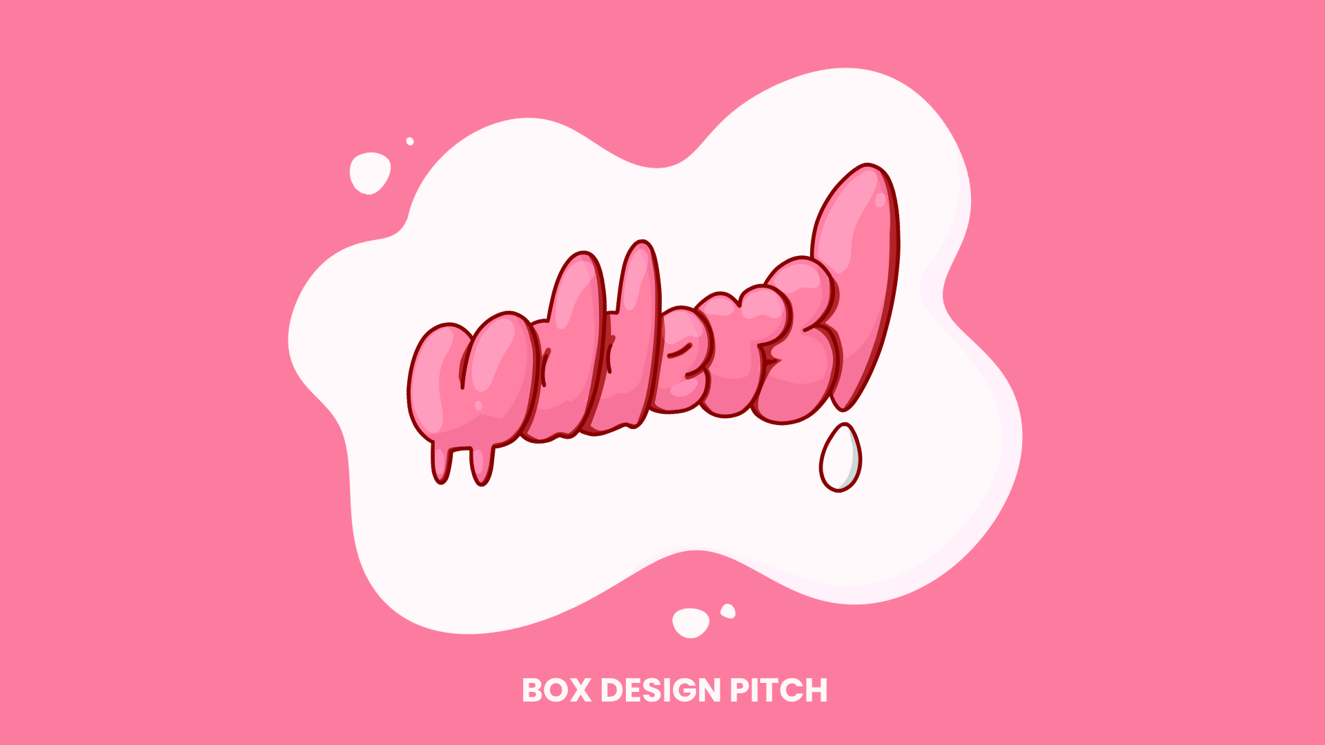
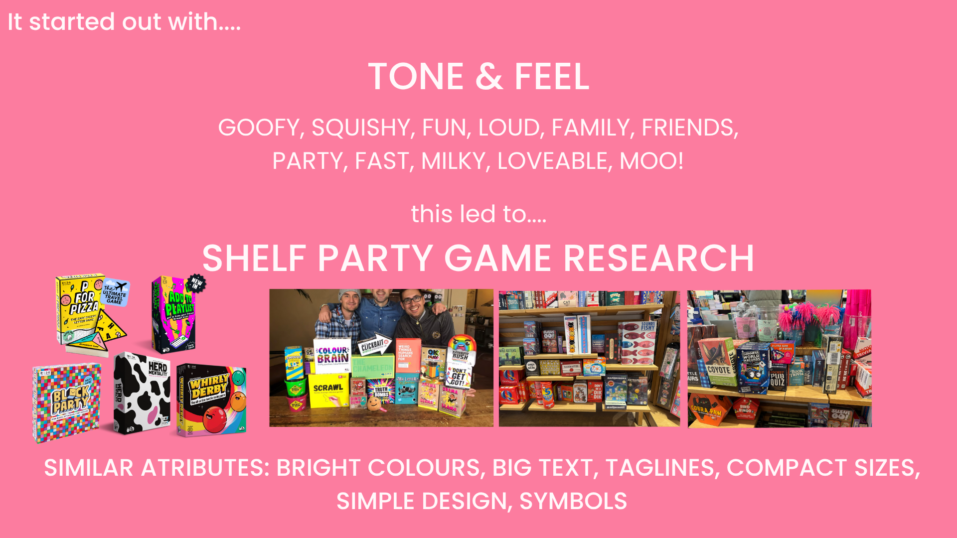
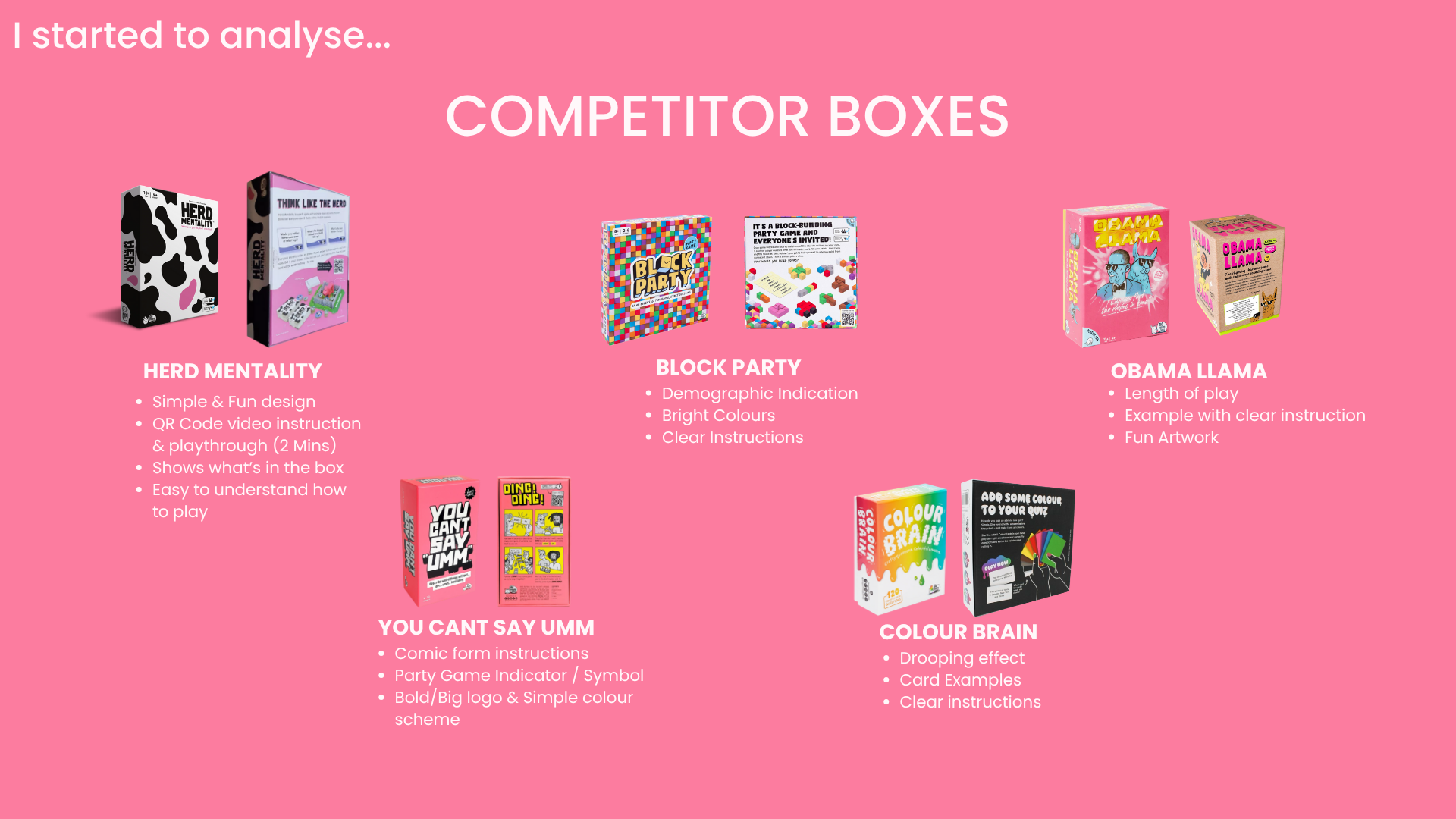
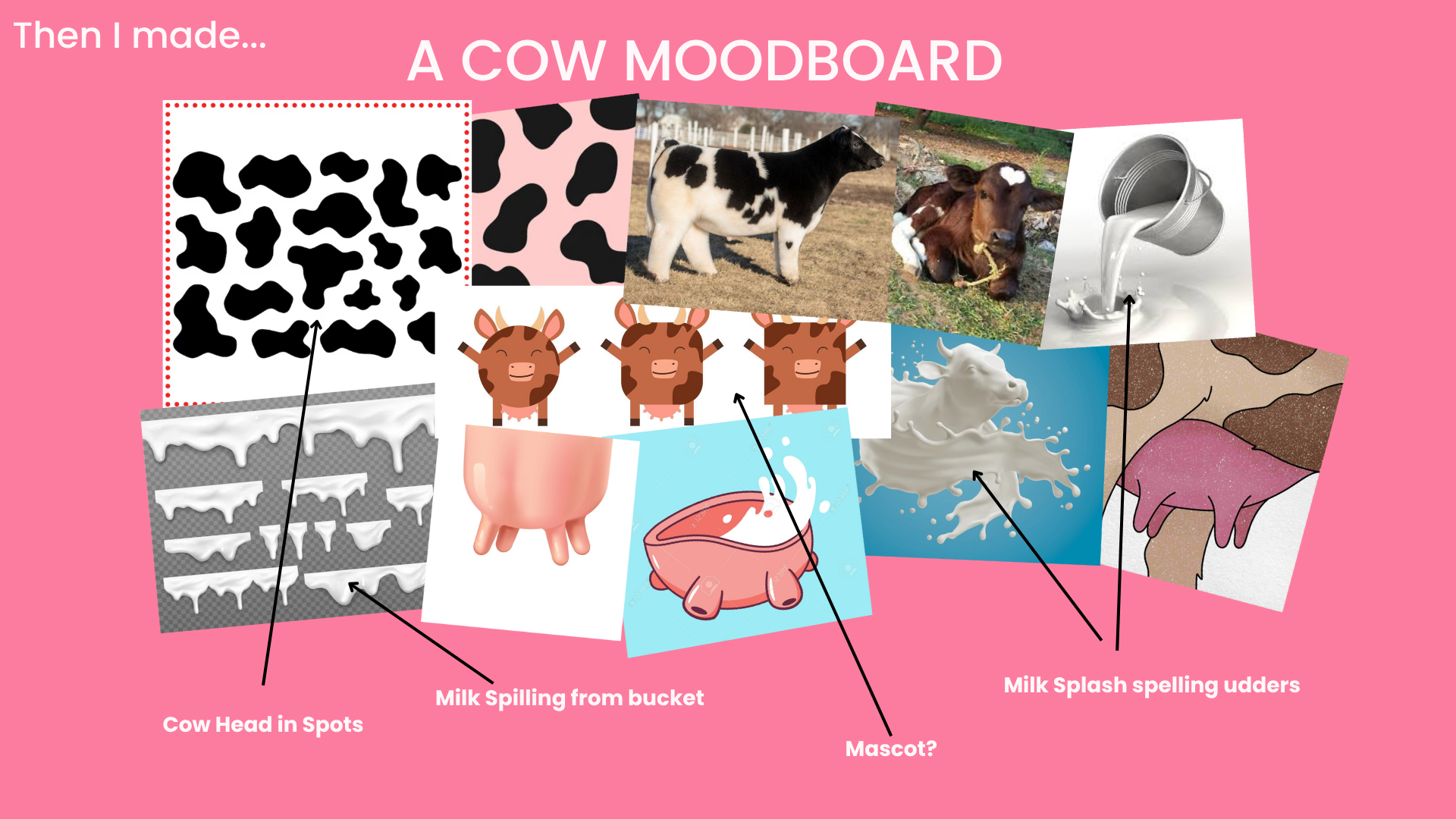
UDDERS BOX BRIEF
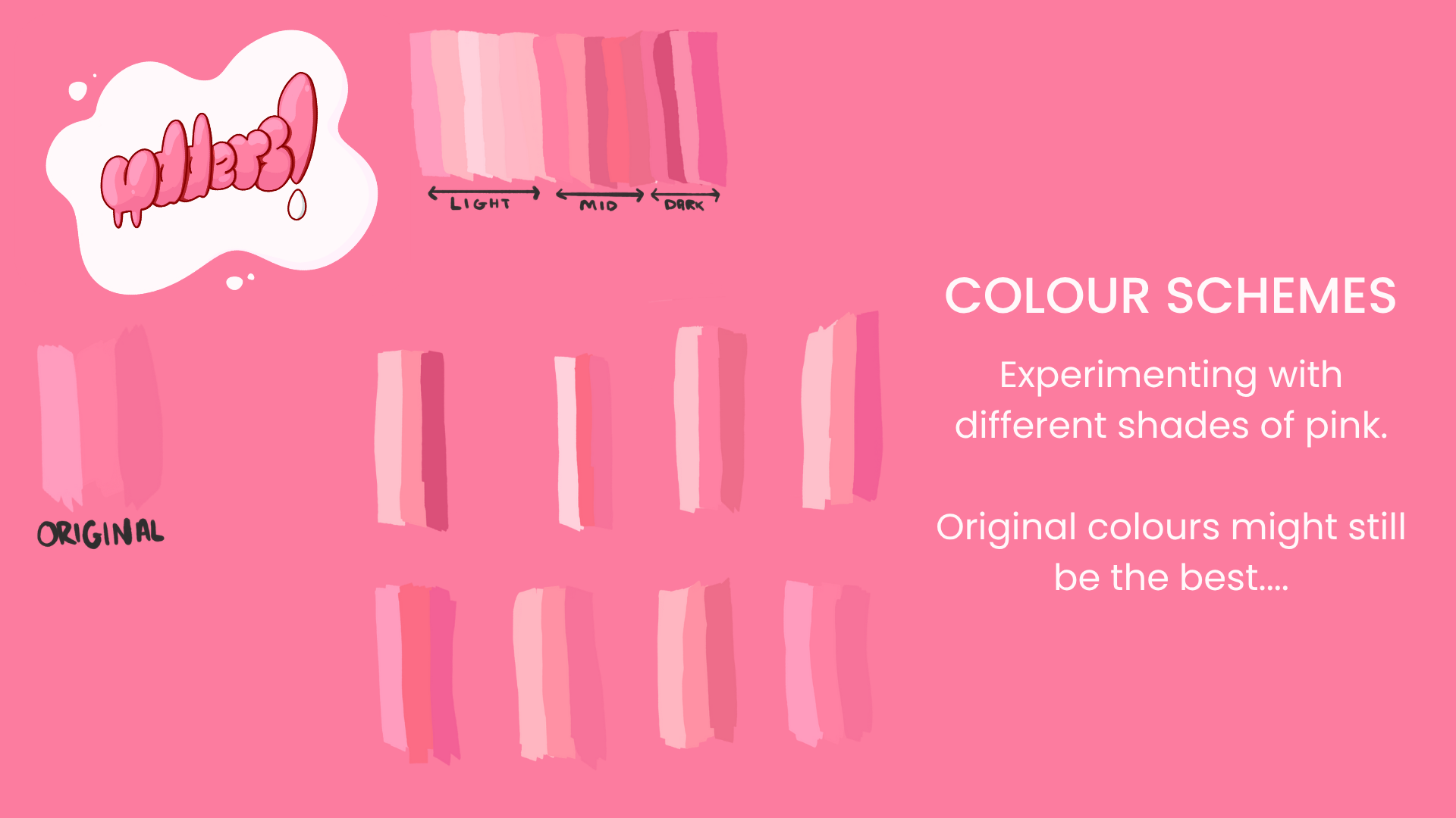
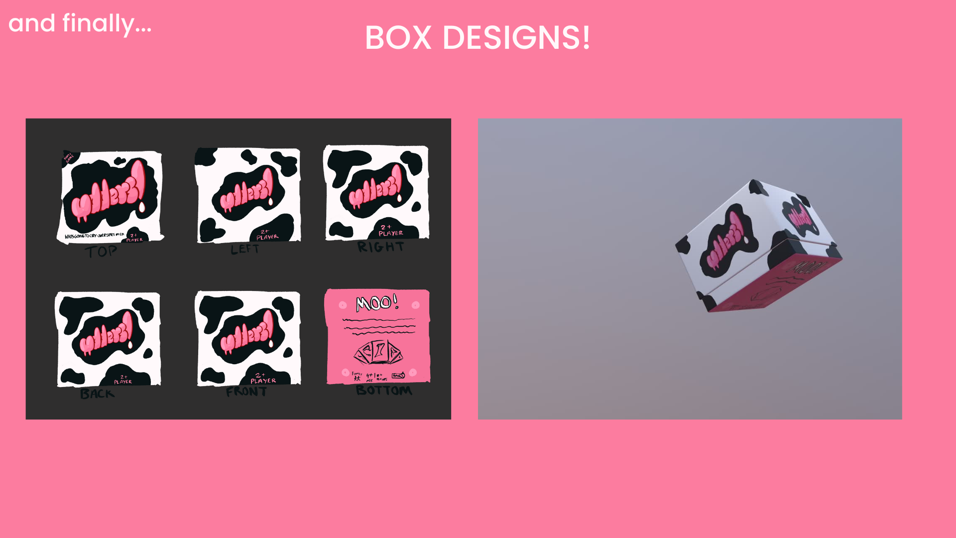
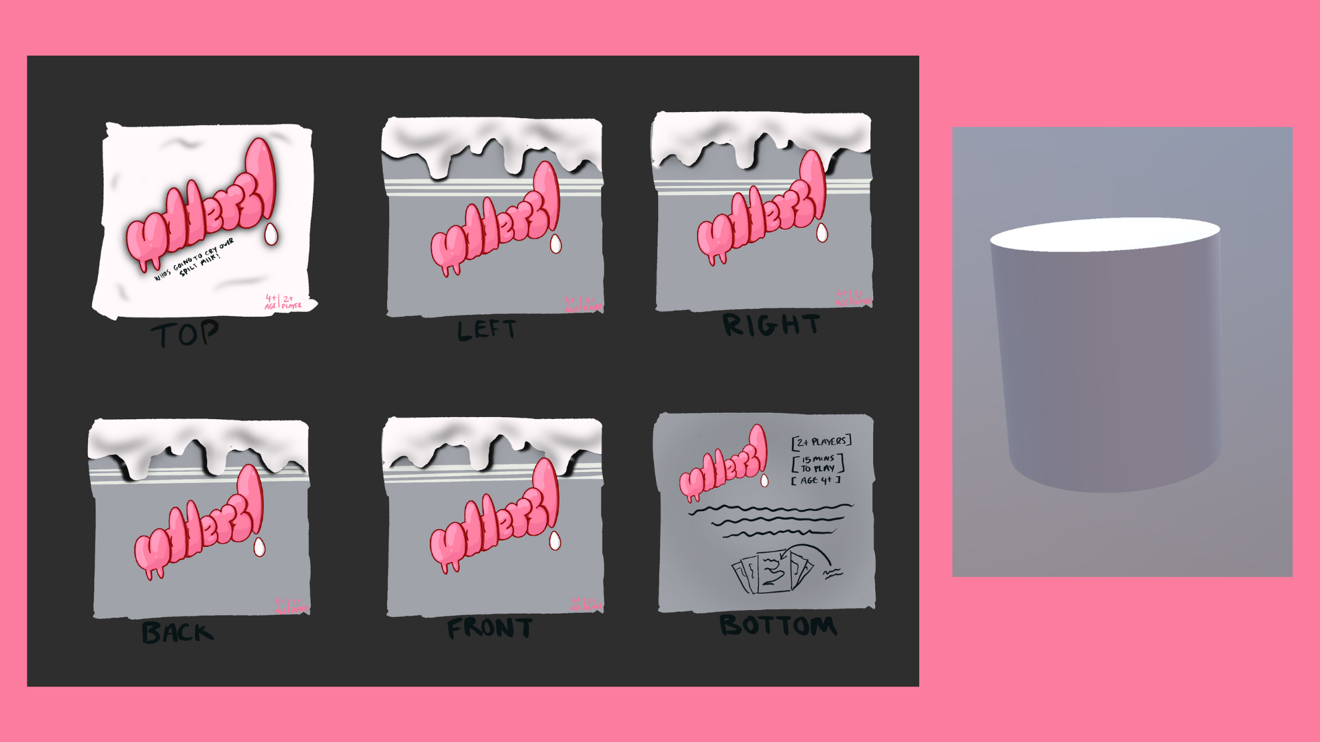
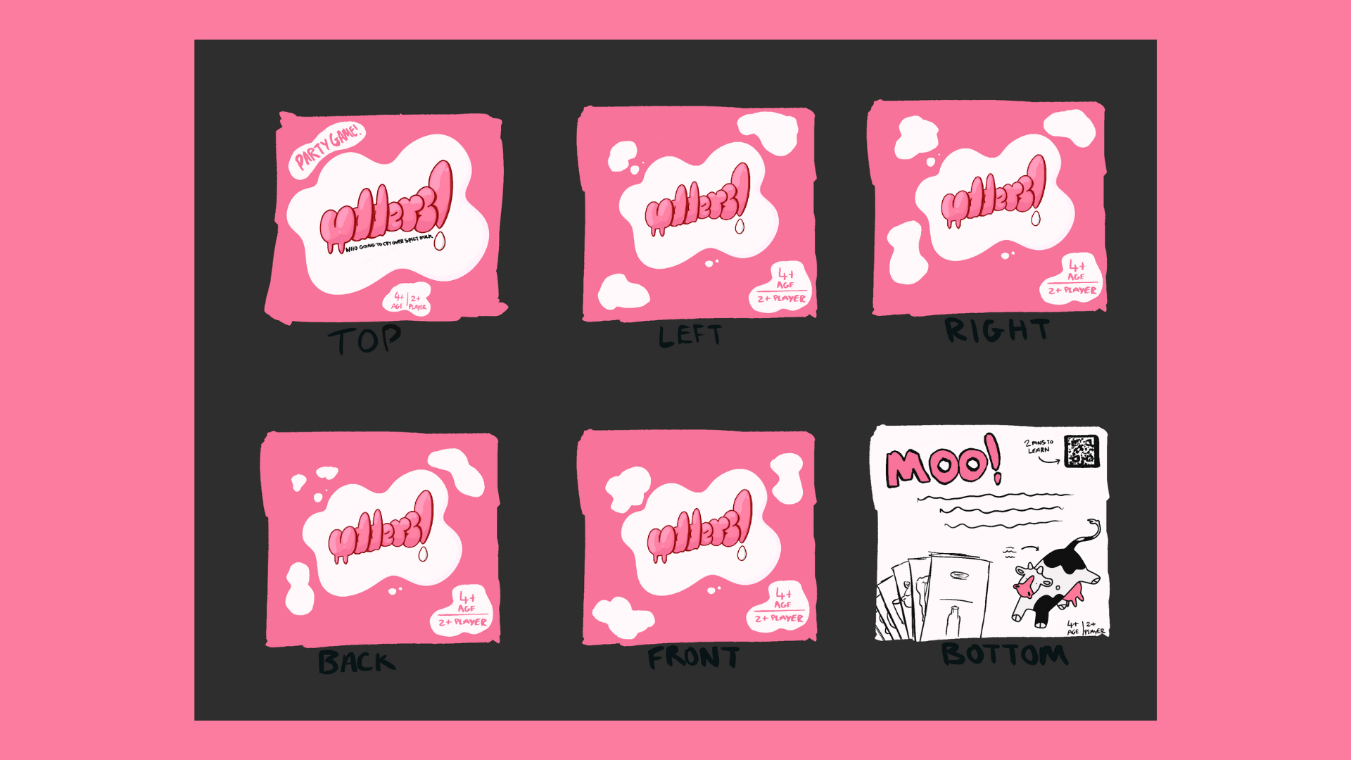
FEEDBACK
REFLECTION
- “Senna - Bucket design is a really cool, unique choice for packaging - can hold square or rectangular cards as well as other goodies. I think it’d be fun and extra immersive if you can start off the game by literally spilling the milk (knocking the cards out of the box).”
- “Senna- great idea and iteration and process work/ simple minimal design choice of cow pattern / milk bucket idea is imaginative and a fresh take. I like the work and think the design and would be good to see it visualised! milk spillage design is very similar to the first one, visually in summary: first design is the most visually effective but milk bucket design is the most interesting. Collab with George? (Olly)”
- “Senna (From Fela) – Well thought out with the designs and visuals.”
- “Senna- your so fancy mate but its all awesome very good research and ideation and lots of good experimentation overall its very good however with the tail design and udders on the bottom maybe make them visually inclusive as instructions can be hard to understand so make it simpler - Abir :)”
- “Senna - A lot of research and experimentation was put into your final outcome especially after re designing your final logo by Waterstones for many reason being a great testament to the effort put in, all of the box designs are very well owned and are unique to their own individual characteristics. Really good seeing a fleshed out/finished version of the backside with the instructions and how cow would be cool to see. (Nic)”
- “Senna- I really love the idea of having a QR code on the back because I think that would make your box more inclusive for overseas for people who may not understand English. I also really like the milk bucket idea as it seems really home the design of the box and all about milk (cows and udders). - Hasti :)”
- “Senna - Images and design is overall always super nice, love the compact box, I love the milk bucket idea, it brings it all back to the same kind of theme, I think the concept of the cow illustration is really nice as well, and the QR code is a very fun extra touch. It really makes it stand out (however a round box would be awkward to show and store alongside trying to fit cards inside). for the final the use of the pink is great makes it really stand out, the box with the cards shown and the cow illustration is a great composition too. - grace”
- “Senna - I like how you looked into so many games and took photos of games displays in a store, its really neat how you took things like rule books and onboarding and compared it to other competing animal themed party games too. Box design 1 is simple but effective, I like the slight variants between each sides design. Milk bucket design is fun and I like the overflowing/dripping design. (Abbie)”
- “Senna - Primary research showed the dedication to the brief and was effective in understanding the current market and the competitors research also shows. Looking at different games helped such as Calligraphy into Artsty really bought out the detail and made it clear where the inspirations came from while communicating the necessary information, especially with the cow theme. In the final, the milk bucket design really stands out but maybe simplify the cow illustration so that the design is respected in the brief and shape should reflect the content of the box better. The first design is interesting, the pink and black colours work but maybe the composition and layout could be refined also. Overall, I think the Typography and tagline might need more refining! to be added. (Jade)”
From the feedback, it's clear people enjoyed the design choices I made. The milk bucket idea in particular stood out as an original, fun and consistent with the brief. I am please that my research and process was clear during the presentation as several people highlighted the development and competitor analysis I compiled. I have positive comments on use of colour, the playful cow themes and the QR code for inclusivity.
At the same time, there are areas I can improve. Several people mention that some parts of the box design might be to complicated or noisy which makes me realise the importance of balancing out creativity with practicality. Typography and tagline consistency were also repeated points so in the future, I need to spend more time refining fonts instead of quickly writing them. Finally the feedback on the box shapes showed me that I need to consider production and retail reality alongside playful concepts.
Moving forward, I would like to simplify my designs and reduce the overall noise, I will consider visual placement and see what works best across all three box designs, I will also refine the typography choices for better readability and potentially prototype my ideas in physical form to test practicality. Using the research and concepts process I have shown, I believe I can push my designs to be suitable choices!
⣿⣿⣿⣿⣿⣿⣿⣿⣿⣿⣿⣿⣿⣿⣿⣿⣿⣿⣿⣿⣿⣿⣿⣿⣿⣿⣿⣿⣿⣿⣿⣿⣿⣿⣿⣿⣿⣿⣿⣿⣿⣿⣿⣿⣿⣿⣿⣿⣿⣿⣿⣿⣿⣿⣿⣿⣿⣿⠀⣿⣿⣿
⣿⣿⣿⣿⣿⣿⣿⡿⠟⢿⣿⣿⣛⣛⣛⠛⠿⣿⣯⠈⣈⣤⡤⠤⢈⣿⣿⣿⣿⣿⣿⣿⣿⣿⠀⣿⣿⠟⢿⣿⣿⣿⠿⠿⠿⣿⣿⣿⣿⠀⣿⣿⣿⣿⣿⣿⣿⡿⢀⣿⣿⣿
⣿⣿⣿⣿⡁⢨⣤⣴⣿⣿⣿⠉⣿⣿⣿⣿⡄⢸⣿⡇⢉⣁⣀⠐⠛⢿⣿⣿⣿⣿⣿⣿⣿⣿⡆⠻⣿⠁⣄⠙⢿⡗⢸⣿⣿⣶⡌⢻⡟⢀⣿⣿⠏⠀⢿⣿⣿⠇⢸⣿⣿⣿
⣿⣿⣿⣿⡇⠸⣿⠿⢿⣿⣿⠐⣿⣿⣿⣿⠃⣼⣿⣿⠈⣿⣿⣿⣿⣦⡌⢿⣿⣿⣿⣿⣿⣿⣿⣤⣉⣴⣿⡇⢸⣿⠘⣿⣿⣿⠇⢸⡇⢘⡿⢁⣴⡀⣾⣿⣿⣷⣿⣿⣿⣿
⣿⣿⣿⣿⣿⡄⢲⣶⣾⣿⣿⣦⣭⣉⣉⣩⣼⣿⣿⣿⣾⣿⣿⣿⣿⣿⣿⣿⣿⣿⣿⣿⣿⣿⣿⣿⡿⠿⠿⠏⣸⣿⣦⣙⣛⣉⣴⣿⣷⣈⣠⣾⣿⡀⢿⣿⣿⠛⠛⣿⣿⣿
⣿⣿⣿⣿⣿⣿⣶⣿⣿⣿⣿⣿⣿⣿⣿⣿⣿⣿⣿⣿⣿⣿⣿⣿⣿⣿⣿⣿⣿⣿⣿⣿⣿⣿⣿⣿⣿⣿⣿⣿⣿⣿⣿⣿⣿⣿⣿⣿⣿⣿⣿⣿⣿⣿⣾⣿⣷⣈⣀⣿⣿⣿
⣿⣿⣿⣿⣿⣿⡟⡃⢸⣿⣿⣿⣿⣿⣿⣿⣿⣿⣿⣿⣿⣿⣿⣿⣿⣿⣿⣿⣿⣿⣿⣿⣿⣿⣿⣿⣿⠟⢹⡿⣿⣿⣿⣿⣿⣿⣿⣿⣿⣿⣿⣿⣿⣿⣿⣿⣿⡿⠟⠻⣿⣿
⠃⣤⣌⠙⠻⢏⣴⡇⣼⣿⣿⣿⣿⣿⣿⣿⣿⣿⣿⠉⣴⡍⠻⣿⣿⣿⣿⣿⣿⣿⣿⣿⣿⣿⣿⡟⢁⣴⣿⣧⠈⣿⣿⣿⣿⣿⣿⣿⣿⣿⡏⢠⠙⣿⣿⡿⢋⡴⢋⣾⣿⣿
⣦⠙⢿⣿⣷⣿⣿⢡⣿⣿⣿⣿⣿⣿⣿⣿⣿⣿⡏⢰⣿⣿⣦⡈⢻⣿⣿⣿⣿⣿⣿⣿⣿⣿⠋⣠⣿⣿⣿⣿⣦⠘⣿⣿⣿⣿⣿⣿⣿⣿⣧⠈⣧⡈⠛⢡⠎⣰⣿⣿⣿⣿
⣿⣷⣦⣉⠛⣿⡇⣾⣿⣿⣿⣿⣿⣿⣿⣿⣿⣿⠀⣾⣿⣿⣿⣿⣦⢸⠻⠿⠿⠿⠿⠿⠿⠇⢰⣿⣿⣿⣿⣿⣿⡄⢻⣿⣿⣿⣿⣿⣿⣿⣿⣦⠙⣷⡾⢃⣾⣿⣿⣿⣿⣿
⣿⣿⣿⣿⣿⣯⣼⣿⣿⣿⣿⣿⣿⢿⣿⣿⣿⠇⢸⣿⣿⣿⣿⣿⣿⣿⣷⣶⣶⣶⣶⣶⣶⣶⣾⣿⣿⣿⣿⣿⣿⣷⠈⣿⣿⣿⣿⣿⣿⣿⣿⣿⡆⠹⢣⣿⣿⣿⣿⣿⣿⣿
⣿⣿⣿⣿⣿⣿⣿⣿⠟⣛⠻⢋⣵⠀⣿⣿⣿⠇⢼⣿⣿⣿⣿⣿⣿⣿⣿⣿⣿⣿⣿⣿⣿⣿⣿⣿⣿⣿⣿⣿⣿⣿⡂⢿⣿⣿⣿⣿⣿⣿⣿⣿⣿⣷⣿⣿⣿⣿⣿⣿⣿⣿
⣿⣿⣿⣿⣿⣿⣿⣿⡀⣿⣷⣿⢋⣾⣿⣿⣿⡆⢸⣿⣿⣿⣿⣿⣿⣿⣿⣿⣿⣿⣿⣿⣿⣿⣿⣿⠏⠻⢿⣿⣿⣿⣷⣾⣿⣿⣿⣿⣿⣿⣿⣿⣿⣿⣿⣿⣿⣿⣿⣿⣿⣿
⣿⣿⣿⡟⢿⣿⣿⣿⣧⡈⠛⣡⣿⣿⣿⣿⣿⣿⠎⣻⣿⣿⡇⠀⠀⢹⣿⣿⣿⣿⢿⣿⣿⣿⣿⡁⠄⢀⣿⣿⣿⣿⡿⣿⣿⣿⠿⣿⣿⣿⣿⣿⣿⣿⣿⣿⣿⣿⣿⣿⣿⣿
⡍⣛⠋⠀⢰⣿⣿⣿⣿⣿⣷⣿⣿⣿⣿⣏⣉⣉⠀⣹⣿⣿⡿⠷⣶⣿⣿⣿⠟⢀⡉⢿⣿⣿⣿⣿⣿⡿⢿⠟⠛⣻⣇⢠⣬⣤⣶⣿⣿⣿⣿⣿⣿⣿⣿⣿⣿⣿⣿⣿⣿⣿
⣿⡄⠟⢠⣾⣿⣿⣿⣿⣿⣿⣿⣿⣿⣿⣿⣿⣯⢀⡿⠑⣋⡄⣼⣿⣿⣿⣯⣴⣿⣿⣤⣽⣿⣿⣿⣿⣀⣴⣮⣤⣾⠇⣸⣿⣿⣿⣿⣿⣿⣿⣿⣿⣿⣿⣿⣿⣿⣿⣿⣿⣿
⣿⣿⣶⣿⣿⣿⣿⣿⣿⣿⣿⣿⣿⣿⣿⣿⢁⣠⠈⢷⣾⣿⣿⣿⣿⣿⣿⣿⣿⣿⣿⣿⣿⣿⣿⣿⣿⣿⣿⣿⣿⡿⢀⣍⣙⡉⢹⣿⣿⡿⠿⣿⣿⣿⡿⣡⠂⣿⣿⣿⣿⣿
⣿⣿⣿⣿⣿⣿⣿⣿⡟⢠⠙⡿⠉⠀⣿⣿⣿⣿⣷⣦⡙⢿⣿⣿⣿⣿⣿⣿⣿⣿⣿⣿⣿⣿⣿⣿⣿⣿⣿⣿⣿⠃⣼⣿⣿⣿⣿⣿⣿⠀⣶⣄⢙⢋⣼⢏⣼⣿⣿⣿⣿⣿
⣿⣿⣿⣿⠁⣌⠙⠛⠇⠸⠁⠀⣰⢡⣿⣿⣿⣿⣿⣿⣷⣤⣽⣿⣿⣿⣿⣿⣿⣿⣿⣿⣿⣿⣿⣿⣿⣿⣿⣿⣿⣿⠉⢿⣿⣿⣿⣿⣿⣧⠈⢿⣿⣿⢇⣼⣿⣿⣿⣿⣿⣿
⣿⣿⣿⣿⡆⢻⡇⠐⠀⠀⠀⢠⠃⣾⣿⣿⣿⣿⠋⣻⣿⣿⣿⣿⣿⣿⣿⣿⣿⣿⣿⣿⣿⣿⣿⣿⣿⣿⣿⣿⣿⣿⣷⣄⠻⣿⣿⣿⣿⣿⣷⣤⡙⢋⣼⣿⣿⣿⣿⣿⣿⣿
⣿⣿⣿⣿⣿⡌⠁⢀⡆⠀⠀⡎⣼⣿⣿⣿⠿⢁⣴⣿⣿⣿⣿⣿⣿⣿⣿⣿⣿⣿⣿⣿⣿⣿⣿⣿⣿⣿⣿⣿⣿⣿⣿⣿⣄⠘⢿⣿⣿⣿⣿⣿⣯⣾⣿⣿⣿⣿⣿⣿⣿⣿
⣿⣿⣿⣿⣿⣿⣦⡘⠃⠀⡸⣰⣿⣿⡟⢋⣴⣿⣿⣿⣿⣿⣿⣿⣿⣿⣿⣿⣿⣿⣿⣿⣿⣿⣿⣿⣿⣿⣿⣿⣿⣿⣿⣿⣿⣧⡀⠙⣿⣿⣿⣿⣿⣿⣿⣿⣿⣿⣿⣿⣿⠿
⣿⣿⣿⣿⣿⣿⠛⢿⣦⣄⢡⣿⡿⠏⣠⣾⣿⣿⣿⣿⣿⣿⣿⣿⣿⣿⣿⣿⣿⣿⣿⣿⣿⣿⣿⣿⣿⣿⣿⣿⣿⣿⣿⣿⣿⣿⣿⣤⠘⢿⣿⣿⣿⣿⣿⠿⠻⠿⠿⠟⣡⡆
⣿⣿⣿⣿⣿⣿⣆⠀⡙⠿⠀⡿⢁⣼⣿⣿⣿⣿⣿⣿⣿⣿⣿⣿⣿⣿⣿⣿⣿⣿⣿⣿⣿⣿⣿⣿⣿⣿⣿⣿⣿⣿⣿⣿⣿⣿⣿⣿⣷⣌⠻⣿⣿⣿⣧⠐⣿⣶⣶⣾⡿⣸
⣿⣿⣿⣿⣿⣿⣿⣧⡊⢷⠀⣴⣿⣿⣿⣿⣿⣿⣿⣿⣿⣿⣿⣿⣿⣿⣿⣿⣿⣿⣿⣿⣿⣿⣿⣿⣿⣿⣿⣿⣿⣿⣿⣿⣿⣿⣿⣿⣿⣿⣷⡈⠿⣿⣿⣧⡌⠻⠿⢿⢡⣿
⣿⣿⣿⣿⣿⣿⣿⣿⣿⢀⠀⢿⣿⣿⣿⣿⣿⢿⠿⣿⣿⣿⣿⣿⣿⣿⣿⣿⣿⣿⣿⣿⣿⣿⣿⣿⣿⣿⣿⣿⣿⣿⣿⣿⣿⣿⣿⣿⣿⣿⣿⣿⣆⠙⣿⣿⣿⣷⣶⣾⣿⣿
⣿⣿⣿⣿⣿⣿⣿⡿⢁⣼⣃⢿⣿⣿⣿⣿⢉⣠⠆⣿⣿⣿⣿⣿⣿⣿⣿⣿⣿⣿⣿⣿⣿⣿⣿⣿⣿⣿⣿⣿⣿⣿⣿⠏⢠⣍⡙⠻⣿⣿⣿⣿⣿⣇⠸⣿⣿⣿⣿⣿⣿⣿
⣿⣿⣿⣿⣿⣿⣿⠃⣼⣿⣗⢸⣿⠟⠁⣨⣿⣿⢀⣿⣿⣿⣿⣿⣿⣿⣿⣿⣿⣿⣿⣿⣿⣿⣿⣿⣿⣿⣿⣿⣿⣿⣿⡇⢺⣿⣿⣦⣉⠻⣿⣿⣿⣿⠞⢉⣿⣿⣿⣿⣿⣿
⣿⣿⣿⣿⣿⣿⣿⢂⠹⢿⣿⡈⢏⣴⣾⣿⣿⣿⢸⣿⣿⣿⣿⣿⣿⣿⣿⣿⣿⣿⣿⣿⣿⣿⣿⣿⣿⣿⣿⣿⣿⣿⣿⡇⢸⣿⣿⣿⣿⣶⣄⣁⣠⣤⣴⣾⣿⣿⣿⣿⣿⣿
⣿⣿⣿⣿⣿⣿⣿⣶⣶⣬⣩⣥⠾⣿⣿⣿⣿⣿⢘⣿⣿⣿⣿⣿⣿⣿⣿⣿⣿⣿⣿⣿⣿⣿⣿⣿⣿⣿⣿⣿⣿⣿⣿⡇⢸⣿⣿⣿⣿⣿⣿⣿⣿⣿⣿⣿⣿⣿⣿⣿⣿⣿
⣿⣿⣿⣿⣿⣿⣿⣿⣿⣿⣿⣿⣦⣿⣿⣿⣿⣿⢸⣿⣿⣿⣿⣿⣿⣿⣿⣿⣿⣿⣿⣿⣿⣿⣿⣿⣿⣿⣿⣿⣿⣿⣿⡗⢸⣿⣿⣿⣿⣿⣿⣿⣿⣿⣿⣿⣿⣿⣿⣿⣿⣿
⣿⣿⣿⣿⣿⣿⣿⣿⣿⣿⣿⣿⣿⣿⣿⣿⣿⣿⣾⣿⣿⣿⣿⣿⣿⣿⣿⣿⣿⣿⣿⣿⣿⣿⣿⣿⣿⣿⣿⣿⣿⣿⣿⣷⣼⣿⣿⣿⣿⣿⣿⣿⣿⣿⣿⣿⣿⣿⣿⣿⣿⣿
06 - 10 - 25
We met Karl Powell today!
His brief? UX/UI Design for his FMP Project Mooncat
You know how it is though, before any project, its a workshop!
This one was to design a polly pocket styled game, swap it with a partner and design UX/UI for that game.
I designed a sewer bike race game with the prompt "Meeting In the Sewer"
I worked on Liliana's design and incorporated elements into it to make it a playable game. We were supposed to digitise it but I might have overlooked that part and made it with a real polly pocket in mind... hehe
moving onto the brief for Project Mooncat
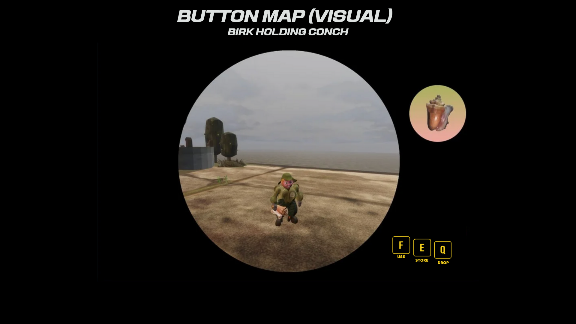
We were tasked to Re-Map the controls from console to PC & Also design a map.
13 - 10 - 25
PROJECT MOONCAT BRIEF
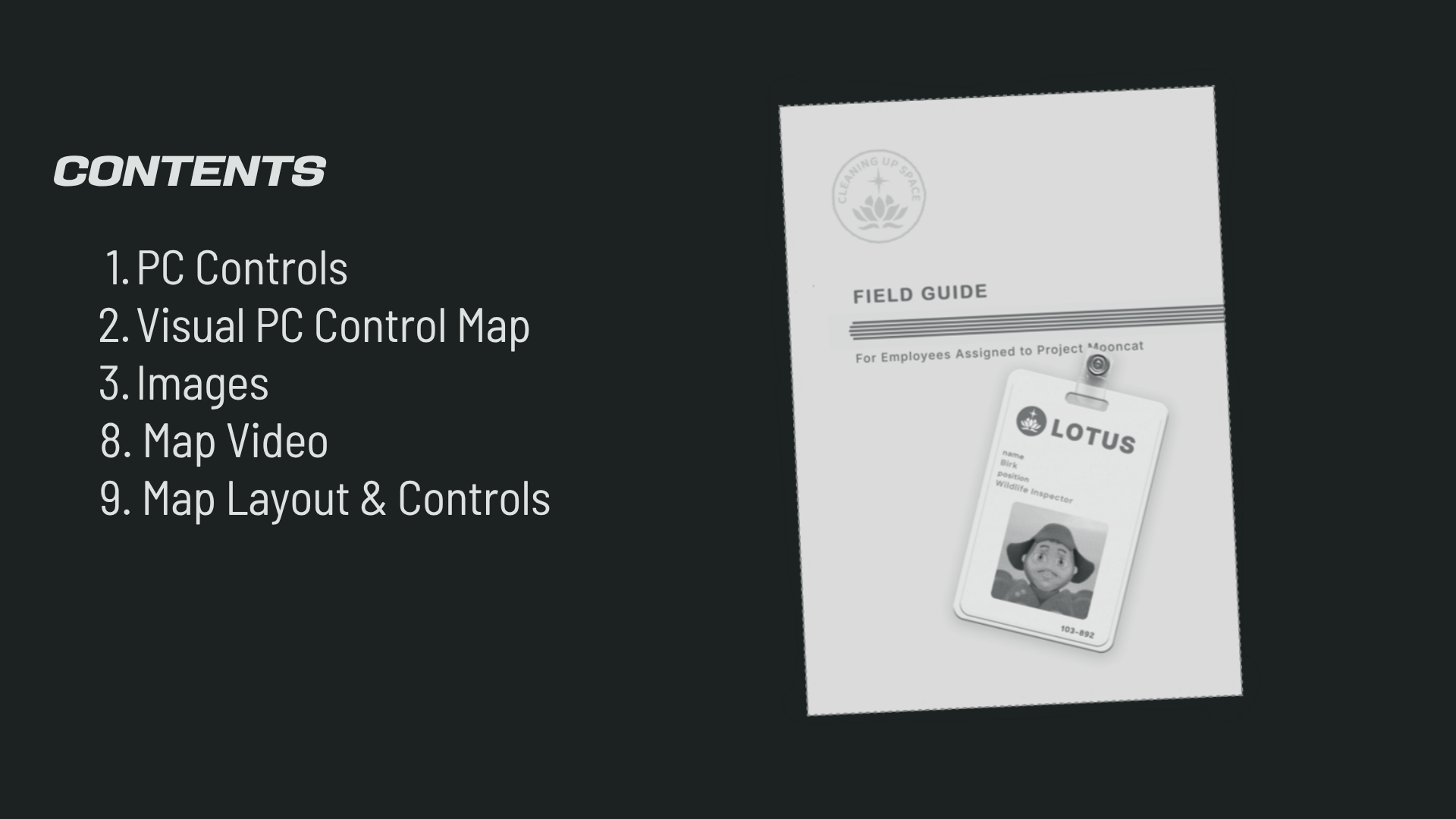
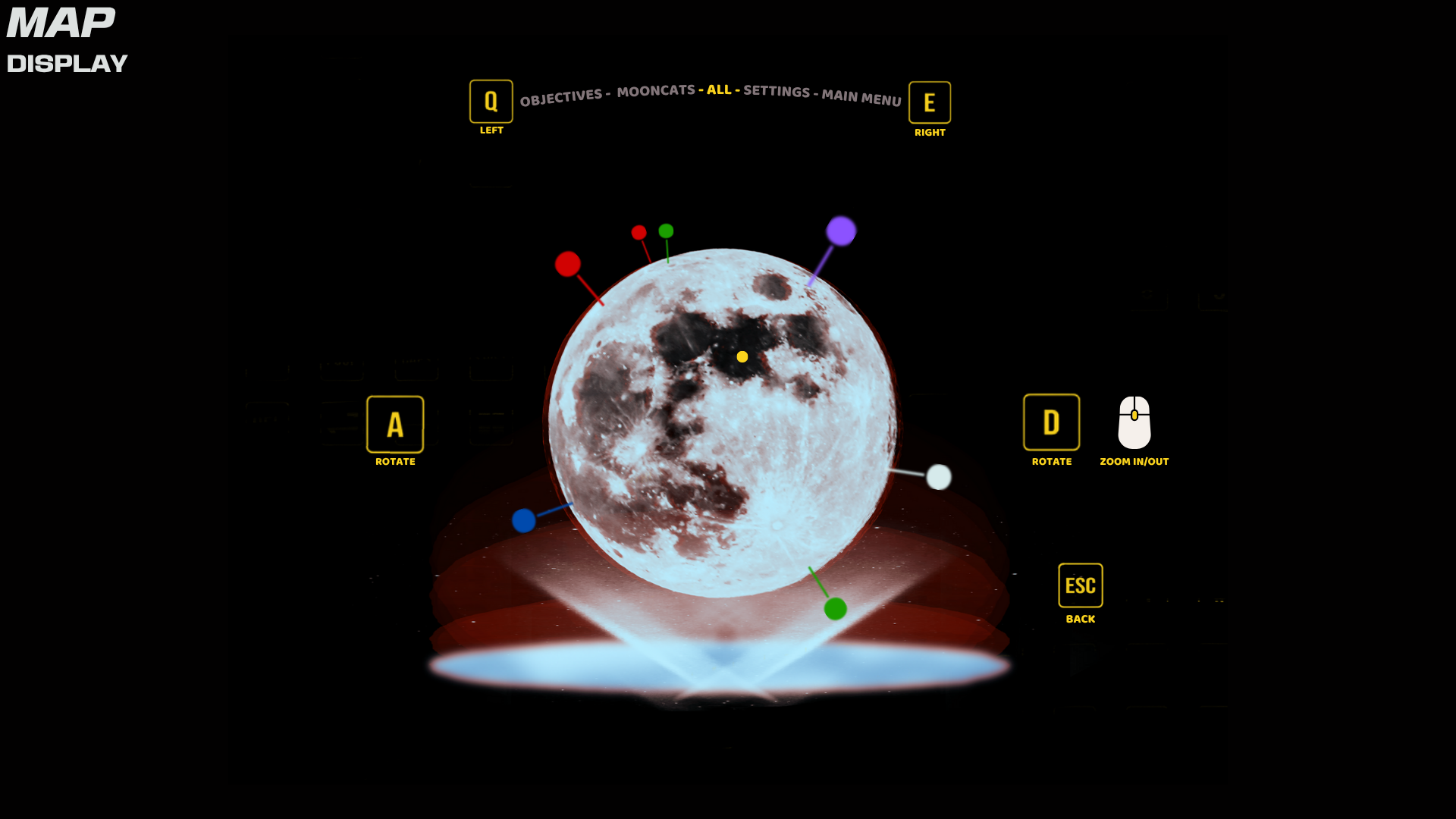
this is my presentation including the map animation example below.
The idea was a holographic map that displays waypoints, you can rotate and zoom in respectively.





FEEDBACK
REFLECTION
Senna — I think overall you have a very good idea and design but I think with the controls try keep them simple and closer.
– Abir
– Abir
From Fela — Good display of the map (Senna)
– Fela
– Fela
Senna — The UI is very well considered! The user is considered at every stage. All visual noise is removed, which gives a clean outcome. One thing to consider is the overall organic feel to the game in contrast to the graphic nature of the buttons/map. It’s beautifully visualised and the planet shape is a smart way to locate the player in the world.
– Olly
– Olly
Senna — Smooth and familiar placement of keybinds, not too much jumping around. Very clear placement of buttons on the screen, especially on the map. Visuals are simple but effective. Is there a way you could make the design quirkier whilst maintaining visual clarity? Just food for thought! Love what you’ve done so far, would like to see you take your ideas further (full realisation of the map, etc.) and see more variation. Well done!
– George
– George
Senna — Visual key buttons are a little too sharp for the game aesthetic. Maybe even using lowercase text for the keys being pressed and in the map UI can give a friendlier feel. The drop of the viewport and projection of the map is really nice and creates a feel of a break between third person and first person. I know they’re just placeholders, but the indicators on the map are quite harsh in colour — softer colours that are more cohesive with the colours of the cats, or Birk himself, would marry the aesthetic within the viewport with the map view. Good job!
– Liliana
– Liliana
Senna — The contents page is a good addition to the presentation. The mapping out of the keybinds as well as the layout for the keys is very clear and easy to understand. Using a fast-paced game like Overwatch for research is bold and clever due to seeing how it could be translated into a slower-paced game. The map ideation is cool and the intro animation for the map is awesome — visually the map is pleasant to look at and easy to navigate with the option to look at specific things. I think that you show creativity with the way that the symbols and keybinds could look like — give them unique shapes or designs because it does look a bit too simple (sorry if that sounds a bit mean).
– Nic
– Nic
From the feedback, it’s clear that people really connected with the thought and planning behind my UI. I’m glad that the layout, key bind placement and overall clarity stood out as those were things I spent a lot of time trying to get right. A few people mentioned that the clean visuals and map projection worked well, which makes me happy because I wanted the interface to feel simple and easy to use without overcomplicating things. It was also nice to see that people picked up on the research side, like the Overwatch reference and my focus on how the player interacts with the game world.
At the same time, there’s definitely stuff I can improve on. Some mentioned that a few elements, like the sharp buttons or the simplicity of the key icons, could be pushed further to fit the game’s style more. I also got notes about using softer colours and adding more variation or quirkiness, which made me realise I can afford to experiment more with personality and tone while still keeping things readable.
Moving forward, I would play around more with shape language, colour, and button design just to make it feel more alive and fitting for the game world. I’ll also look at how I can refine text and icons so everything feels cohesive and natural to the player. Overall, I’m happy with how my design thinking came across, and with a bit more polish and experimentation, I think I can push this UI even further.
⣿⣿⣿⣿⣿⣿⣿⣿⣿⣿⣿⣿⣿⣿⣿⣿⣿⣿⣿⠿⣿⡟⠯⡶⠛⠓⠒⠃⠉⠈⠙⠁⠉⠓⠘⠯⢿⣻⡿⣿⡿⢿⣿⣿⣿⣿⣿⣿⣿⣿⣿⣿⣿⣿⣿⣿⣿⣿⣿⣿⣿⣿⣿⣿⣿
⣿⣿⣿⣿⣿⣿⣿⣿⣿⣿⣿⣿⣿⣿⣿⣿⡿⣻⣺⠿⡑⠌⠁⠀⠀⠀⠀⠀⠀⠀⠀⠀⠀⠀⠀⠀⠀⠀⠉⠀⠈⠓⠯⢽⣻⢿⣿⣿⣿⣿⣿⣿⣿⣿⣿⣿⣿⣿⣿⣿⣿⣿⣿⣿⣿
⣿⣿⣿⣿⣿⣿⣿⣿⣿⣿⣿⣿⣿⣿⢟⢙⡺⢇⠓⠢⠁⠄⠀⠀⠀⠀⠀⠀⠀⠀⠀⠀⠀⠀⠀⠀⠀⠀⠀⠀⠀⠀⠀⠀⠀⠉⠓⢽⣻⣿⡿⣿⣿⣿⣿⣿⣿⣿⣿⣿⣿⣿⣿⣿⣿
⣿⣿⣿⣿⣿⣿⣿⣿⣿⣿⠟⣿⣭⡔⡿⢣⠙⢢⠉⡄⢃⡐⠈⠀⡀⠠⠀⠀⠀⠀⠀⠀⠀⠈⠄⢀⠀⠀⠀⠀⠀⠀⠀⠀⠀⠀⠀⠀⠩⠍⡿⣜⢿⣿⣿⣿⣿⣿⣿⣿⣿⣿⣿⣿⣿
⣿⣿⣿⣿⣿⡿⠿⣟⣛⣵⣿⣿⠷⣌⢇⠣⡍⢂⠱⡈⠆⡄⢁⠂⠀⠀⠀⠀⠀⠀⠀⠀⠀⠈⢂⠀⠄⠁⡀⠀⠀⠀⠀⠀⠀⢀⠀⠁⠂⢌⢀⠚⣷⢻⣿⣿⣿⣿⣿⣿⣿⣿⣿⣿⣿
⣿⣿⡿⡫⢓⣭⣲⣖⠿⣿⣻⢏⡟⡼⣌⠓⣌⢃⡒⡡⠎⠰⡈⠤⠀⠀⠀⠀⠀⠀⠀⠀⠈⠀⠂⡀⠌⠀⠀⠀⠐⠀⠀⠄⠀⢀⠠⠁⠌⠄⡊⠰⣈⠛⣫⠿⣛⣛⣛⣿⣿⢿⣿⣿⣿
⣿⢟⠄⣰⣿⣾⢷⣫⣿⣟⢧⡿⣸⠱⣌⠹⡐⢎⡰⢁⠎⡱⢈⠆⡁⠀⠀⠀⠀⠀⠀⠀⠀⠀⠀⢀⠐⠀⠂⠀⠀⠀⠀⠀⠀⠠⠀⠌⡄⢃⠔⡡⢂⡙⡔⣪⢰⣓⡞⡶⣤⣍⠺⢝⢿
⠿⡆⣴⣿⣾⢏⡓⢬⣽⣿⢎⡳⢥⠲⡌⢣⡉⢦⡑⡌⢖⡡⢎⢆⠠⢁⠂⡔⠠⠀⡀⢀⠀⠀⠀⠠⠀⠀⠀⠀⠀⠀⠄⢂⠈⠠⠑⡌⠰⣈⠰⣀⠣⣘⠰⢥⠳⣎⡷⢿⣽⣾⣿⢆⡱
⠠⢣⣿⣿⡻⢄⠣⡸⣜⡟⣧⠸⣀⠧⡘⢇⡸⢃⠤⣛⣄⡻⡸⡜⣄⠃⠜⡀⢇⠠⢀⠀⠀⠀⠃⠀⠀⠀⠀⠀⢀⠠⡘⠀⢄⠃⠧⣘⠣⡀⢇⠀⠤⣀⠛⡤⢟⢧⣻⢟⡿⣻⢟⡿⡄
⢈⠻⣽⢧⡁⠂⢒⡵⣊⡝⢆⡓⡰⢌⡱⢪⡔⢫⡜⣦⣙⣳⢷⣹⢢⠅⠠⢘⠤⡃⢆⠀⠂⡐⢈⠀⢈⠠⠀⢈⡐⠆⠡⠘⢠⢋⡷⣌⢒⡵⡈⠜⠰⢠⠉⠖⡭⢺⠱⣋⠖⣹⢋⣿⢡
⠸⣅⢻⣗⣮⠰⢤⡛⣜⠸⢌⠲⡡⢎⡴⢣⣚⠵⣚⠴⣩⢞⡧⣟⢦⠊⢁⠂⠼⡇⢊⡴⡁⢐⢂⢀⠎⢰⡁⠦⣅⠋⠄⠡⢎⣧⣻⡜⣲⠴⡉⠎⡑⢂⡉⠆⠥⣃⠣⠔⣈⠦⢃⢞⣼
⠈⣆⠦⣹⡷⣍⠲⣹⢢⡝⣨⠑⡆⢏⡖⣏⠾⣭⣳⢏⣷⢫⠾⣝⣦⠃⠄⠨⣜⣏⢶⣳⠣⠘⣆⢣⢹⢊⢧⣏⠖⣉⠀⢃⠾⣜⢶⣊⡕⣪⠱⣉⢆⠣⠘⣈⠒⡠⡑⢬⡓⢸⣣⣿⣿
⣶⡌⡦⠠⣹⡻⣗⢮⡓⢼⠠⢏⡜⣳⠺⣍⡟⡶⡽⣙⠎⠯⡹⠙⠮⠛⢶⢲⣮⣿⡞⣧⢃⡷⢰⢨⠍⡚⡾⣽⢚⡤⣤⢮⡿⣭⠯⣝⠾⣱⢋⠶⢌⢢⠑⡄⠣⡔⡹⢆⠱⣃⣿⣿⣿
⣿⣿⣜⢗⡠⢿⣝⣧⢹⢒⡏⢶⢩⠖⣹⢎⡽⠱⠙⠈⠀⠀⠀⠀⠀⠀⠀⠹⣳⢯⡿⣃⢬⣻⡅⢿⡄⢹⢳⡽⣨⠃⠀⠁⠑⠠⠙⠈⠧⢁⡋⠜⡌⢂⠌⡰⢣⢜⡡⢂⣝⣼⣿⣿⣿
⣿⣿⣿⣾⣫⣶⣹⢎⡧⢓⡜⢣⡝⢪⠁⡌⢠⡀⡀⠀⠀⠀⠀⠀⠀⠀⠀⠀⠨⡟⢡⢣⢘⡧⣏⠳⡜⢠⢟⡖⠁⠀⠀⠀⠀⠀⠀⠀⠀⠀⠈⠒⢌⠢⡘⢄⠣⢎⣴⢟⣾⣿⣿⣿⣿
⣿⣿⣿⣟⢼⣿⣛⠮⣜⠣⡜⣡⠚⡄⢳⠸⣓⡾⣷⡀⠀⠀⠀⠀⠀⠀⠀⠀⠐⠱⡉⠖⠈⠐⠉⠁⠘⠡⢊⠜⠀⠀⠀⠀⠀⠀⠀⠀⠀⣶⣲⡀⢈⠰⡁⢎⡘⠲⡾⢸⣿⣿⣿⣿⣿
⣿⣿⣿⣿⢺⣿⣯⢻⣌⢳⡘⢄⠣⡜⢤⢋⠴⡉⡙⢻⠶⢲⡴⠖⠶⠣⠃⠀⠀⠀⠀⠀⠀⠀⠀⠀⠀⠀⠀⠀⠀⠀⠦⣤⢤⣀⣄⡴⣻⠷⢣⡑⠠⢁⠜⡠⢍⣳⢡⣾⣿⣿⣿⣿⣿
⣿⣿⣿⣿⡄⣿⣏⡳⡌⢦⡉⠦⣑⣞⡦⣍⠢⣁⢁⠂⢄⢢⡐⢌⡰⠀⠄⠠⢀⡀⠀⠀⠀⠀⠤⣁⠀⠀⠀⠀⠀⠀⡀⢀⠂⡡⢈⠐⡁⠌⢠⠀⠅⢂⠰⢡⣎⢳⣿⣿⣿⣿⣿⣿⣿
⣿⣿⣿⣿⣿⣮⡻⣵⣩⢆⡙⢦⡱⢾⡽⣞⣷⡶⣭⢞⡴⣦⡝⣮⠐⡩⠌⠱⢺⡴⠁⠀⢠⠘⡰⢁⢂⠀⠀⢘⣄⠣⡐⠃⠞⡰⢆⢆⡐⡈⢄⡈⠐⠠⡑⣮⢳⣿⣿⣿⣿⣿⣿⣿⣿
⣿⣿⣿⣿⣿⣿⣿⣮⣻⢮⡝⡶⢯⣳⡽⣻⢿⣿⣿⣿⣿⣾⣽⣷⡟⡷⢾⣵⣿⣿⣡⢆⡀⢠⠡⢈⠀⣀⢦⣻⣮⣵⣌⠷⣭⡳⣭⣒⢖⡘⠆⡤⠁⠆⡱⣢⣿⣿⣿⣿⣿⣿⣿⣿⣿
⣿⣿⣿⣿⣿⣿⣿⣿⣧⢇⡟⣜⡩⠳⣽⣏⣿⣻⣿⣿⣿⣿⣿⣟⣿⡵⣿⣶⣿⣿⡿⣯⡜⡀⠂⢈⡴⢯⣾⣿⣟⣯⡝⡾⣵⣛⣷⡹⢮⣙⠣⠄⢡⡿⣽⣿⣿⣿⣿⣿⣿⣿⣿⣿⣿
⣿⣿⣿⣿⣿⣿⣿⣿⣿⢰⡿⣆⠦⡅⢢⢛⣿⣿⣿⣿⣿⣿⣿⣿⣿⣿⣳⢞⣳⢲⡱⠆⠌⠁⠀⠒⠜⣎⠶⢯⣟⣯⢿⣷⣻⣞⢶⢫⠓⡬⠑⣈⢹⢸⣿⣿⣿⣿⣿⣿⣿⣿⣿⣿⣿
⣿⣿⣿⣿⣿⣿⣿⣿⣿⡇⣿⣯⡳⣌⠣⣍⠲⣝⡿⣿⣿⣿⣿⣿⣿⣿⣿⣿⣌⢧⢦⣱⣊⠴⣒⡰⢢⣄⠉⣻⠼⣯⢟⣷⡛⡜⢧⡋⡑⠰⣈⠐⣶⢸⣿⣿⣿⣿⣿⣿⣿⣿⣿⣿⣿
⣿⣿⣿⣿⣿⣿⣿⣿⣿⣧⣟⣿⣳⣎⡳⢬⡻⣜⢿⣳⣿⣿⣿⣿⣿⣿⣿⣿⣿⣿⣿⣷⣯⣿⣴⡿⣷⢾⣻⡽⡛⠍⢋⠰⠉⠄⢀⠀⠢⡁⠐⣹⡮⣿⣿⣿⣿⣿⣿⣿⣿⣿⣿⣿⣿
⣿⣿⣿⣿⣿⣿⣿⣿⣿⣧⢹⣿⣷⣿⣽⣧⢻⣼⢻⡟⣿⣿⣿⣿⣿⣿⣿⣿⣿⣿⣿⣿⣿⣿⡟⣿⢹⡏⡖⢡⡅⠂⡄⠂⢡⠘⡄⢢⢱⠘⢣⢳⢱⣿⣿⣿⣿⣿⣿⣿⣿⣿⣿⣿⣿
⣿⣿⣿⣿⣿⣿⣿⣿⣿⣿⢘⣿⣷⢫⡟⣾⡽⣯⣿⣽⣿⢿⣿⣿⣿⣿⣿⣿⣿⣿⣿⣿⣿⣿⣿⣣⢯⡜⢆⠣⡔⠢⠔⡊⠔⣢⠱⣊⠤⣉⠞⡞⣸⣿⣿⣿⣿⣿⣿⣿⣿⣿⣿⣿⣿
⣿⣿⣿⣿⣿⣿⣿⣿⣿⣿⡎⣻⡼⢧⡛⡜⠹⢟⣯⣿⣿⣿⣿⣿⣿⣿⣿⣿⣿⣿⣿⣿⣿⣿⣯⣟⣧⢻⣌⠳⣌⢣⡙⣌⢳⡐⢣⠜⢢⠍⣎⡷⣿⣿⣿⣿⣿⣿⣿⣿⣿⣿⣿⣿⣿
⣿⣿⣿⣿⣿⣿⣿⣿⣿⣿⣧⠷⡛⢧⢛⡬⢓⠬⡘⠘⡹⣯⣿⣿⣿⣿⣿⣿⣿⣿⣿⣿⣿⣿⣭⣿⣼⣳⢮⣻⠬⣇⡛⢌⠃⡌⡱⢊⡵⡚⡴⣟⣿⣿⣿⣿⣿⣿⣿⣿⣿⣿⣿⣿⣿
⣿⣿⣿⣿⣿⣿⣿⣿⣿⣿⡿⣡⠜⡈⢣⠘⡩⢒⡁⢠⣧⣟⣻⠷⢿⣻⣿⣿⣿⣿⣿⣿⣿⣿⡿⣽⢿⣭⡟⣷⠻⢤⡑⢂⡜⣰⣃⠯⣔⠳⣘⡯⣿⣿⣿⣿⣿⣿⣿⣿⣿⣿⣿⣿⣿
⣿⣿⣿⣿⣿⣿⣿⣿⣿⣿⢱⡁⠀⠐⡀⠂⡡⠃⢀⢸⢰⣿⣿⣿⣿⣶⣯⣭⣽⣿⣿⣿⣿⣮⣿⣛⣛⣚⣃⠌⣹⢦⡙⢦⡜⣦⠹⣜⠢⡝⢢⢇⣿⣿⣿⣿⣿⣿⣿⣿⣿⣿⣿⣿⣿
⣿⣿⣿⣿⣿⣿⣿⣿⣿⣿⡢⣁⣴⣃⡤⣊⢴⣲⣾⣬⣾⣿⣿⣿⣿⣿⣿⣿⣿⣿⣿⣿⣿⣿⣿⣿⣿⣿⡟⣬⢳⡣⢟⡣⠞⣌⠳⢌⠓⡌⡏⣿⣿⣿⣿⣿⣿⣿⣿⣿⣿⣿⣿⣿⣿
⣿⣿⣿⣿⣿⣿⣿⣿⣿⣿⣿⣿⣿⣷⣶⣶⣿⣿⣿⣿⣿⣿⣿⣿⣿⣿⣿⣿⣿⣿⣿⣿⣿⣿⣿⣿⣿⣿⢃⢏⠣⢙⠊⠴⣉⠐⠂⠌⡐⣸⣹⣿⣿⣿⣿⣿⣿⣿⣿⣿⣿⣿⣿⣿⣿
⣿⣿⣿⣿⣿⣿⣿⣿⣿⣿⣿⣿⣿⣿⣿⣿⣿⣿⣿⣿⣿⣿⣿⣿⣿⣿⣿⣿⣿⣿⣿⣿⣿⣿⣿⣿⣿⣿⢙⠀⠈⠀⠠⢀⠀⠌⡐⣀⠂⡞⣽⣿⣿⣿⣿⣿⣿⣿⣿⣿⣿⣿⣿⣿⣿
13 - 10 - 25
A WORLD NOT MADE FOR ME BRIEF
For this project, I was tasked with designing new artwork for one of the mini-games from A World Not Made for Me, focusing on accessibility and inclusivity. I chose the Memory Game, as its simple and familiar mechanics naturally align with the game’s tone of reflection, warmth, and emotional connection. I wanted to reimagine it as something both visually comforting and accessible to a wider range of players, without losing the soft feel of the original world.


FEEDBACK
(FROM CHLOE)
(FROM CHLOE)
REFLECTION
I’ve had a proper look and this is really lovely work. I love how closely you’ve followed the style guide and kept the soft, comforting tone of the game. The accessible mock-up is much clearer, and the added labels work really well.
The only thing I’d push further is scale and variety: the original “normal” cards do feel quite small, especially for a game where accessibility comes first. I’d love to see the base version a bit larger, and maybe different difficulty levels (easy/medium/hard) that change grid size or amount of information while keeping the readable style you’ve built here.
I chose the Memory Game because it fits really well with the themes of A World Not Made for Me — it’s calm, familiar, and comforting. The matching mechanic is simple and gentle, which matches the slower, reflective tone of the world. I also liked that it gave me space to explore accessibility without changing the personality of the game.
For the accessible version, I focused on players who might struggle with small details or visual fatigue. I made the animals bigger, added labels, and increased contrast and spacing so the cards were easier to read and interact with, while still keeping the soft, hand-drawn style.
Chloe’s feedback was helpful because she pointed out that the overall tone and accessible mock-up worked really well, but the normal cards could be scaled up and the game could include different difficulty levels. It made me think more about how accessibility and gameplay can grow together, and how I could push the design further in the next iteration.
⣿⣿⣿⣿⣿⣿⣿⣿⣿⣿⣿⣿⣿⣿⣿⣿⣿⣿⣿⠟⢻⣿⣿⣿⣿⣿⣿⣿⣿⢛⢿⣿⣿⣿⣿⣿⣿⣿⣿⣿⣿⣿⣿⣿⣿⣿⣿⣿⣿ ⣿⣿⣿⣿⣿⣿⣿⣿⣿⣿⣿⣯⣿⣿⣿⣿⣿⣿⠇⣼⡘⣿⣿⣿⡿⣿⣿⣿⡿⢨⣆⢿⣿⣿⣿⣿⣿⣿⣿⣽⣿⣿⣿⣿⣿⣿⣿⣿⣿ ⣿⣿⠋⢀⣿⣿⠙⣿⣿⣿⣿⣿⣿⣿⣿⣿⣿⡏⣸⣿⡇⣿⣿⣿⣿⣿⣿⣿⡇⣿⣿⡈⣿⣿⣿⣿⣿⣿⣿⣿⣿⣿⣿⣿⣻⣿⣿⣿⣿ ⣿⣿⣿⣿⣿⢧⣷⡜⣿⣿⣿⣿⣿⣿⣿⣿⣿⢀⣿⣿⡇⠻⣛⣛⣛⣛⠻⢛⣃⣿⣿⣧⢹⣿⣿⣿⣿⣿⡟⣿⣿⣿⣿⣿⣿⣿⣿⣿⣿ ⣿⣿⡿⠿⢋⣼⣿⣿⣬⣭⣉⣥⡄⣹⣿⣿⡇⣼⣿⡟⣼⣿⣿⣿⣿⣿⣿⣿⣿⣿⣿⣿⠈⣿⣿⣛⣟⣟⡧⢹⢿⢿⣿⣿⣿⣿⣿⣿⣿ ⣿⠠⣤⣼⣿⣿⣿⣿⣿⡿⠟⢃⣼⣿⣿⣿⡇⢸⡿⢀⣿⣿⣿⣿⣿⣿⣿⣿⣿⣿⣿⣿⡇⣿⣿⣿⡗⣇⣿⢌⠹⣿⣿⣿⣿⣿⣿⣿⣿ ⣿⣿⣦⣍⠿⢹⣿⣿⣿⣅⠸⣿⣿⣿⣿⣿⡇⢸⢧⣞⢿⣿⣿⣿⣿⣿⣿⣿⣿⣿⣿⣿⡅⣿⣿⣯⣾⣿⣿⣮⡷⢿⣟⣿⣿⣿⣿⣿⣿ ⣿⣿⣿⡟⢠⣿⢛⣷⡌⣿⣦⠹⣿⣿⣿⣿⠃⡀⣾⠿⠀⢉⠋⠻⢿⣿⢿⣛⡋⠉⠻⣿⡇⣸⣿⣿⣿⣿⣿⣿⣿⣿⣿⣿⣿⣿⣿⣿⣿ ⣿⣿⣿⠇⠛⣣⠀⣿⣇⢳⣮⣀⣹⡿⣿⣿⡄⡃⣿⣶⣄⣼⣹⣤⢾⣿⣿⣿⣧⣤⣦⣿⣇⣿⣿⣿⣿⣿⡿⣿⣿⣿⣿⣿⣿⣿⣿⣿⣿ ⣿⣿⣿⣷⣾⣿⡇⣿⣿⢸⣿⣿⣿⣿⣿⣿⠃⣷⢿⣿⣿⡿⠿⠿⢾⣿⣿⣿⣿⣿⣿⣿⣿⢸⣿⣿⣿⣿⣿⣿⣿⣿⣿⣿⡿⣿⣿⣿⣿ ⣿⣿⣿⣿⣿⣿⣧⢸⣿⡈⣿⣿⣿⣿⣿⣿⡄⣿⢯⣿⡄⠀⣶⣶⣶⣶⠲⠶⠀⢨⣿⣿⡇⣿⣿⣿⣿⣿⣿⣿⣿⣿⣿⣿⣿⣿⣿⣿⣿ ⣿⡿⠟⣋⣉⣉⣛⠸⡏⡇⠻⣿⣿⣿⣿⣿⡇⣟⣯⣿⣇⠀⠙⣛⢛⠐⣒⡒⠀⣸⣿⣿⡇⢻⣿⣿⣿⣿⠿⠿⠛⣛⣉⣉⣛⡛⠿⣿⣿ ⠏⣴⣿⣿⣿⣿⢿⠀⣏⢧⢰⡦⣌⡙⠻⢿⣧⣘⠚⠙⠿⠿⠿⠿⠿⠿⠿⠿⠿⢿⡿⣟⣣⡿⠟⣋⣡⣴⣶⣿⣿⣿⣿⣿⣿⣿⣷⡌⢻ ⢨⣿⣟⣿⣿⢾⣿⡇⢸⢾⠘⣽⢯⣝⡷⣢⢌⡙⠿⠛⠀⢀⠂⠡⠌⠂⠍⠂⠄⠈⠻⠛⣡⣴⣾⢿⣿⣿⣿⡿⣿⣾⣿⣿⣿⣿⣿⣯⠘ ⡀⣿⡟⣾⣟⡿⣽⣇⠘⣿⡆⢽⡻⡽⣽⡉⢿⡞⠃⣄⠀⠀⠎⠒⠈⠓⠐⠂⠐⢀⡴⠛⣷⠿⣿⣿⣿⡿⣿⡿⣿⢯⣿⣾⣿⡟⣯⡁⢰ ⣷⣌⠹⡷⡯⣽⢧⣿⠀⢞⣇⠸⣏⠙⠀⠀⠀⠀⢀⣴⣶⡀⠀⠀⠀⠀⠀⠀⣀⣾⣇⠀⠰⠀⠀⠙⢻⣿⡽⣟⡿⣿⢯⣟⢾⡻⠃⣴⣿ ⣿⣿⣷⣬⡙⠳⣏⣾⠡⠈⢿⠀⠀⠀⠀⠀⡄⠀⣼⣿⣿⣿⠷⠶⠤⠖⠴⢾⣿⣿⣿⡄⠀⠀⠀⠀⠀⠱⠿⣯⢟⡵⡯⠟⣈⣴⣿⣿⣿ ⣿⣿⣿⣿⣿⣷⣦⣬⡁⠀⢸⠀⣤⣀⡀⠀⡇⢰⣿⠟⢁⣤⡆⠀⣲⣆⠀⣶⣤⡉⢻⣷⡀⢀⠀⠀⠀⢀⠘⠓⣋⣡⣴⣾⣿⣿⣿⣿⣿ ⣿⣿⣾⣿⣿⣿⣿⣿⠿⠀⠈⠇⠻⣿⡷⢸⣧⣿⣷⠀⢻⡟⠿⠿⢿⡟⠿⠟⣿⠟⢠⣿⣷⣼⡀⣶⣿⣿⣷⣜⠻⣿⣿⣿⣿⣿⣿⣿⣿ ⣿⣿⣿⣿⣿⣿⠟⠡⠄⠀⠀⠐⠀⠉⠀⢸⣿⡽⣿⣿⣦⣄⣐⣠⣄⣐⣀⣠⣤⣴⣿⣿⣿⣿⡇⠾⠟⠋⠉⠉⠓⠨⠻⣿⣿⣿⣿⣿⣿ ⣿⣿⣿⣿⣿⣿⠀⠀⠀⠀⠀⠀⠀⠀⠀⣽⣳⣻⢷⣻⣾⢿⣿⣿⣿⣿⣿⣿⣿⣿⡿⣟⡿⣻⠄⠀⠀⠀⠀⠀⠀⠀⠀⣿⣿⣿⣿⣾⣿ ⣿⣿⣿⣿⣿⣿⣦⠀⠀⠀⠀⠀⠀⠀⠀⠘⠑⠉⠋⠙⠊⠛⠉⠋⠙⠉⠋⠙⠃⠋⠙⠉⠓⠉⠚⠀⠀⠀⠀⠀⠀⠀⢸⣿⣿⣿⣿⣿⣿ ⣿⣿⣿⣿⣿⣿⣿⡧⠀⠀⠀⠀⢀⠀⠀⠀⠤⢁⠂⠔⡀⢂⠔⠠⢂⠔⠠⢂⠐⣀⠂⡐⢀⢂⠐⠀⠀⢀⣠⣄⡀⠀⢸⣿⣿⣿⣿⣿⣿ ⣿⣷⣾⡹⢿⣿⣿⣿⣶⣆⠐⠀⠚⣁⣰⣮⣴⡌⢒⣤⣬⣄⠎⢐⣡⣬⣠⠡⢆⣤⣦⡀⢤⣦⡤⣀⣀⠈⠋⢛⣛⡶⠾⣿⣿⣿⣿⣿⣿ ⣿⣿⣿⣿⣾⣿⣿⣿⣿⣿⡦⢀⣾⣿⣿⣿⣯⣴⣿⣿⣿⣿⣷⣿⣿⣿⣿⣶⣿⣿⣿⣿⣶⣤⣶⣿⣿⣷⣤⣾⣿⣿⣷⠌⣿⣿⣿⣿⣿ ⣿⣿⣿⣿⣿⣿⣷⣌⠻⠟⣃⣙⡛⠿⡩⣿⣿⣿⣿⣿⣿⣿⣿⣿⣿⣿⣿⣿⣿⣿⣿⣿⢿⣿⡟⣿⣟⠟⢛⣛⣻⣛⣡⣾⣿⣿⣿⣿⣿ ⣿⣿⣿⣿⣿⣿⣿⣿⣿⣿⣿⣿⣿⣿⡇⠀⠀⠀⠀⠀⠀⠀⠀⠀⢿⠽⠀⢀⠀⠀⠀⠀⠀⠀⠀⣩⣴⣿⣿⣿⢿⣿⣿⣿⣿⣿⣿⣿⣿ ⣿⣿⣿⣿⣿⣿⣿⣿⣿⣿⣿⣿⣿⣿⡇⠀⠀⠀⠀⠀⠀⠀⠀⢐⣿⡠⠀⠀⠀⠀⠀⠀⠀⠀⠀⣾⣿⣿⣿⣿⣿⣿⣿⣿⣿⣿⣿⣿⣿ ⣿⣿⣿⣿⣿⣿⣿⣿⣿⣿⣿⣏⣿⣿⡇⠀⠀⠀⠀⠀⠀⠀⠀⠀⣿⡇⠀⠀⠀⠀⠀⠀⠀⠀⠀⣿⣿⣿⣿⣿⣿⣿⣿⣿⣿⣿⣿⣿⣿ ⣿⣿⣿⣿⣿⣿⣿⣿⣿⣿⣿⣿⣿⣿⡇⠀⠀⠀⠀⠀⠀⠀⠀⠀⣻⣷⠀⠀⠀⠀⠀⡀⠀⠀⠀⣿⣿⣿⣿⣿
10 - 11 - 25
MAGI TECH BRIEF
Manon's brief was focused on 2D Pose to Pose animation.
I'll be honest, it's not my favourite line of work, but a brief is a brief.
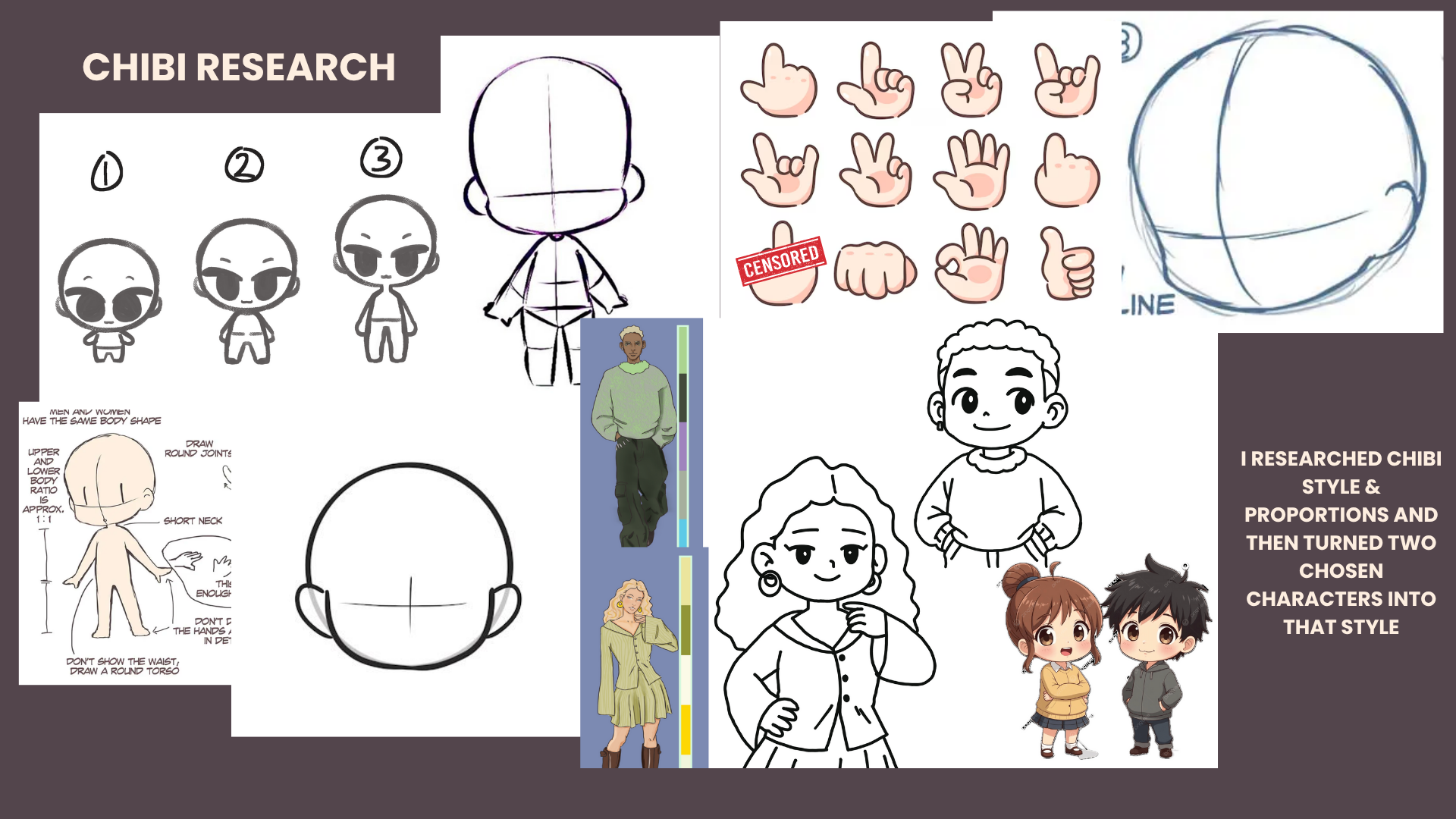
I started by analysing the brief to see what was expected. She wanted gestures/expressions of two chosen characters, one sad, one happy, in a chibi-like style.
I started by breaking down the chibi style and then turning my two chosen characters into that style. It struggled with the eyes and decided to simply make them one solid colour, which I think still achieves the effect asked for.
Once I had the Chibi Characters, it was just a matter of drawing different expressions on their face and slight body language movements to indicate success or sadness.
This took me all weekend.



HAPPY/SMUG ABOUT WINNING
SAD ABOUT LOSING
FEEDBACK
REFLECTION
Senna - Good style research and strong reference images. The animations are clear and easy to understand, and the variety of poses communicates emotion well. You kept the characters’ individual styles accurate, which is appreciated. Only small note is that Rahim’s head feels too big in one frame, and Flora’s subtle hand movements fit her attitude perfectly. – Manon
Senna - Great research into the chibi style. The sketches are clean and the final animations are strong. The sad emotion reads really well through the body language, especially the arms pressing in. Adding colour palettes could push the outcome even further. – Nic
Senna - Really solid background research, almost like a personalised style guide. You captured the likenesses of the characters well and the final animations look polished. The poses suit the characters and aren’t overly dramatic. I’d love to see more of the drawing process behind them. – George
Senna - Good chibi style research before animating and your final animations are strong. The delay between the smug face and the thumb going up works really nicely. There are a few inconsistencies like Flora’s earring changing size, and the final style didn’t fully match the references shown, so showing that process would help. – Abbie
Senna - The gifs are really well done with clear, consistent line art and a style that suits the project. You could push some movements further for exaggeration. Keep an eye on consistency like line thickness and repeated details. Full colour versions would be exciting to see, and your ideation/moodboards are strong. Duplicating frames and only moving hands or heads could help reduce line wobble. - Someone
Overall, I’m really happy with the feedback I got. People seemed to really like the poses, the emotions, and how I kept the characters’ individual details. A few points came up about consistency like lineweight wobbling in some frames, the size of Flora’s earring changing, and Rahim’s head being a bit too big in one pose. These are things I didn’t notice at first but I definitely see now.
A lot of people mentioned wanting to see more of my process, like how I got from my chibi research into the style I ended up using. Next time I’ll document that more clearly instead of skipping over it. Someone also pointed out that duplicating frames and only animating the hands or head would help stabilise the lineart, which is useful and something I’ll try next time.
Overall, I think the animations worked well, especially the emotions and subtle movements, but I can still push exaggeration a bit more and improve consistency.
I dont think I will work on this project further but its good to know the areas I can improve on should I ever have an animated project again.
★░░░░░░░░░░████░░░░░░░░░░░░░░░░░░★
★░░░░░░░░███░██░░░░░░░░░░░░░░░░░░★
★░░░░░░░░██░░░█░░░░░░░░░░░░░░░░░░★
★░░░░░░░░██░░░██░░░░░░░░░░░░░░░░░★
★░░░░░░░░░██░░░███░░░░░░░░░░░░░░░★
★░░░░░░░░░░██░░░░██░░░░░░░░░░░░░░★
★░░░░░░░░░░██░░░░░███░░░░░░░░░░░░★
★░░░░░░░░░░░██░░░░░░██░░░░░░░░░░░★
★░░░░░░███████░░░░░░░██░░░░░░░░░░★
★░░░█████░░░░░░░░░░░░░░███░██░░░░★
★░░██░░░░░████░░░░░░░░░░██████░░░★
★░░██░░████░░███░░░░░░░░░░░░░██░░★
★░░██░░░░░░░░███░░░░░░░░░░░░░██░░★
★░░░██████████░███░░░░░░░░░░░██░░★
★░░░██░░░░░░░░████░░░░░░░░░░░██░░★
★░░░███████████░░██░░░░░░░░░░██░░★
★░░░░░██░░░░░░░████░░░░░██████░░░★
★░░░░░██████████░██░░░░███░██░░░░★
★░░░░░░░░██░░░░░████░███░░░░░░░░░★
★░░░░░░░░█████████████░░░░░░░░░░░★
★░░░░░░░░░░░░░░░░░░░░░░░░░░░░░░░░★